The Gaylord and Dorothy Donnelley Foundation has three different program areas – land conservation, artistic vitality, and regional collections – and supports that program work in two distinct regions – the Chicago Region and the Lowcountry of South Carolina. Through meetings and convenings, grant applications and reports, maps and shared databases, we collect an extraordinary amount of information about the work being done by grantees and others to further our mission.
What do we do with all that data? What tools do I use as a grants manager to analyze that data? How do I share that knowledge to other staff, our board, and the field?
Role of Grants Management
In my role as grants manager, I oversee the processes by which we gather most of this data – both qualitative and quantitative. As the “keeper” of the data, I compile and analyze that information to share back to our program staff and ultimately our board of directors.
Our foundation has a staff of nine, so we use a team approach in our work. There is no evaluation department, let alone a grants management department. Owning my knowledge management role has earned me a place at the meeting table when it comes to decisions about our grantmaking and program strategies. I’m part of the discussion from developing program metrics, to what information do we need versus want from applicants, to looking at report data in aggregate and interpreting what it tells us about the effectiveness of the Foundation’s strategies.
In reporting out to the board, I make decisions on what information best supports the stories we’re sharing about our programs, identifying photos and creating charts to include in written reports. For board and committee meetings, I am in planning meetings to make decisions on what visuals will support the verbal presentations. If a report includes information on grant processes or related data, I do that presentation at the board meeting.
Tools I Use
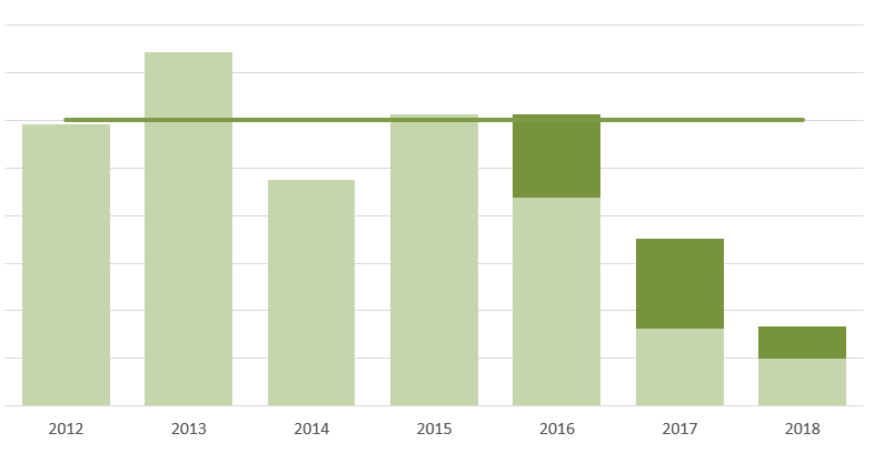
A handful of tools and resources help me visualize that information. I use Excel most often for static reports and doing quick charts for basic information, such as how much did we grant in land conservation last year?
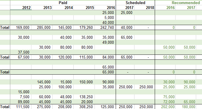
That means turning this:
Into something more people can read and understand quickly, like this:
For more complex analysis and interactive visualizations, I’ve started using Tableau. I can easily drag and drop fields to explore the data. It’s also great for presentations, as I can filter different measures on the fly, and the visualization adjusts accordingly. Recently I attended Tableau’s annual conference, where I learned a great deal about mapping – very helpful for a foundation with such specific geographic goals. I’m looking forward to learning and using Tableau more for analysis.
Next Steps
And to what end? Data visualized in a more compelling way allows us to see patterns, compare trends, and at the end of the day, make more informed decisions. Whether it’s to ask questions about why grantmaking decreased in one year over another, compare the budgets of organizations that do or do not have an annual plan in place, or see what counties may need more capacity building support. Data isn’t always binary; it’s one part of what we refer to as our “mission cycle”.
Grants managers are perfectly positioned to help their foundations use data more effectively for decision making. I’ve found that taking initiative on this front has allowed me to contribute more meaningfully to the big-picture work we are doing and provide a valuable service to colleagues, board, and grantees along the way.
Resources
Tableau Foundation for Non-profits
Data Analysts for Social Good (webinars, conference)
Cole Nussbaumer Knaflic – Storytelling With Data
Ann K. Emery – data analysis & visualizations
Meet the Author

Susan Clark
Grants Manager, Gaylord & Dorothy Donnelley Foundation
Principles for Peak Grantmaking
Read more insights related to this Principle:
Steward Responsively
Related Topics
Technology ManagementRelated Articles
From Fixing Forms to Fixing the System: A Call to Action
READ
How Technology Can Improve the Grantee Experience
READ
How Your GMS Can Drive Equitable Grantmaking
READ